The People’s Climate March-How Big is the Problem?

The New York Times, among many other news outlets, reported on the September 21 People’s Climate March:

I have nothing to add to these reports, and nothing to report about the much smaller march in Portland, Oregon:

http://koin.com/2014/09/21/climate-march-in-portland-hold-polluters-accountable/

Climate change is a serious problem that needs to be addressed. The changes in atmospheric composition since the industrial revolution have created a greenhouse effect, as predicted by Svante Arrhenius. The principle gasses contributing to the effect are carbon dioxide and methane. The largest human made source of carbon dioxide is due to the combustion of coal, oil, and natural gas. Significant methane releases are due to production and handling of these fuels.

How much of these fuels does the US use? What are they used for? The DOE’s Energy Information Agency compiles data from which two figures are published each year.

http://www.eia.gov/totalenergy/data/monthly/previous.cfm

US Total Energy 2013

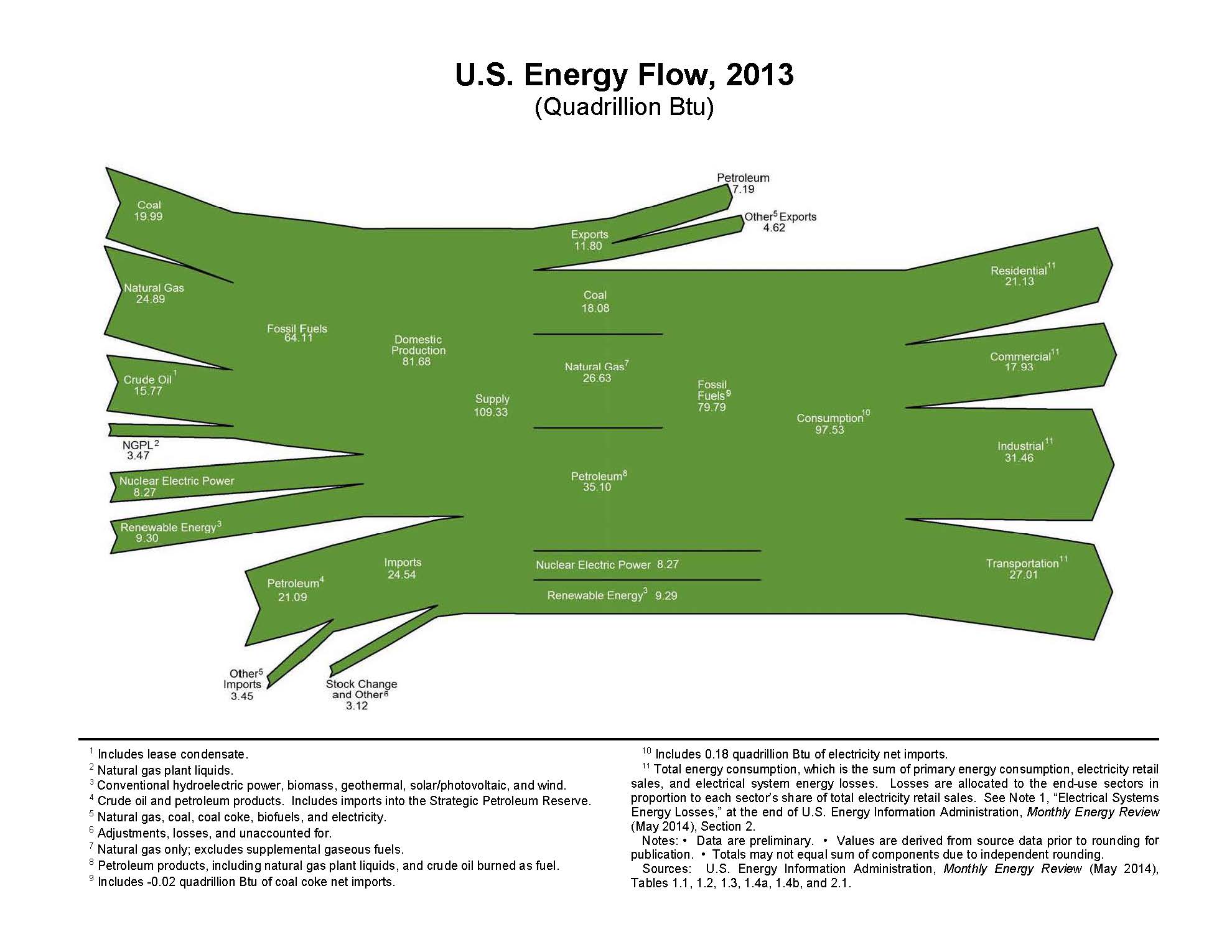
The figure shows sources of energy used during 2013 in the US. Natural gas is the largest source at 24.80 quadrillion BTU (quads). Petroleum Imports is the second largest at 21.09 quads. “Petroleum Imports” refers to crude oil, natural gas condensate, and all refined products, including gasoline, diesel fuel, bunker fuel, etc. Coal is the third largest source at 19.99 quads. US crude oil production is fourth at 15.77 quads. Natural gas liquids (NGPL) is a minor energy source at 3.47 quads. Nuclear power provides 8.27 quads, and renewable energy (hydropower, biomass, geothermal, solar/photovoltaic) provide 9.3 quads.

The chart shows that some energy is exported, a total of 11.80 quads. Thus the total US energy supply in 2013 was 97.53 quads. Fossil fuels supplied 79.79 quads, or about 82 percent of US energy. Replacing a significant fraction of these fossil fuel supplies is a daunting task.

Where does the US use these energy. The EIA supplies a figure for this too:

US Energy Flows 2013

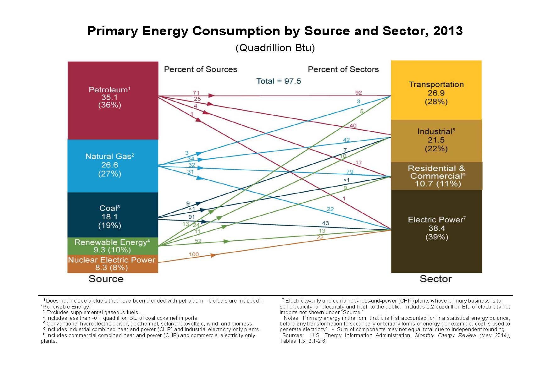
As this figure shows, transportation uses 26.9 quads. Petroleum supplies 92 percent of transportation energy. Transportation uses 28 percent of US energy.

Industry, including manufacturing, heating and electricity for factories, uses 21.5 quads, or 22 percent of US energy.

Stores, houses, and apartments account for 10.7 quads, or 11 percent of total US energy.

Electric power generation is the largest user of energy in the US at 38.4 quads, or 39 percent of total US energy. Over 90 percent of coal is used for electric power generation.

Natural gas is used in three sectors of the economy in almost even quantities: 34 percent by industry, 31 percent in electric generation, and 32 percent for heating houses, apartments, and stores.

Reducing crude oil consumption calls for a radical change in the US transportation system. Reducing coal consumption in favor of renewable energy calls for an equally radical change in the production of electricity. Reducing natural gas consumption calls for changes in almost every sector of the economy.

These two charts make one thing clear: there is no easy solution to the US carbon dioxide and methane emissions problem.

Oil Price Forecasts: An Example from 1983


The Hubbert peak oil forecast assumes the production of oil (or gas or other commodities) follows a logistics curve from initial production to final resource exhaustion. The area under the “Hubbert Peak Oil” curve represents the total oil to be produced, or the total oil resource that has and will be exploited. The curve represents the volume of oil produced per unit time. In most forecasts, years or decades represent the unit time. We can read the curve as barrels of oil produced per year or per decade.


Economists consider supply and demand to be functions of price. The volume of a product consumed in day or a year or other time period is thus considered to be a function of the average price for that time period. If we want to perform a forecast of peak oil or ultimate oil consumption for a oil producing province, or a country, or the world, then we would like to have a forecast of the oil price for the remaining history of oil production. This is a difficult problem. Consider an example from 1983:

BrentPrice

The figure shows a price forecast made by a major oil company. It was used to evaluate potential projects in a variety of basin and countries. It was also used to forecast company revenues from existing production. Discussions with colleagues working in  other companies and host governments at the time suggested that this scenario was similar to scenarios used throughout the industry.

At the time of the forecast, Brent crude traded for about $30 a barrel. Although the price was forecast to remain flat for a few years, by 1986 it was expect to begin rising modestly each year until about 1997. From then until the end of the forecast period, it was forecast to rise to $120 a barrel.

The figure shows the actual price oil in nominal terms through 2011. The nominal price of oil fell to below $20 a barrel for 16 years, with only a few brief intervals above $20. It reached its nadir in December, 1998 at less than $10 a barrel. (http://www.eia.gov/dnav/pet/hist/LeafHandler.ashx?n=PET&s=RBRTE&f=M)

From then it rose, with one pause, to over $100. Although it never averaged $120 per barrel for an entire year, it did average over $120 a barrel in April 2011 and March 2012.

Nominal prices do not reflect inflation. For much of the forecast period inflation fell, becoming quite low in recent years. Using the CPI to discount the nominal price to 1983 dollars shows the price never came close to $100 a barrel, and has only recently approached $50 a barrel in 1983 dollars.

From today’s perspective, the error in the 1983 forecast may seem obvious. Oil production was increasing in North America and the North Sea at that time. OPEC members were cheating on their quotas. The high oil prices of the previous decade led to increased transportation fuel efficiency, as well as fuel substitution in many sectors of the economy.

In 1970, however, it seemed that oil would remain below $5 a barrel for many years. The Arab oil boycott just a few years later was not foreseen. For many years a nominal price above $3 a barrel seemed far fetched.

Not knowing the future price of oil, it is very problematic to assume the future production of oil will follow a simple logistic curve. This should give pause to those who predict either a near term collapse in production or a future with abundant supplies.


The Problem with OPEC Reported Reserves

MEOilReserves OPED

The Organization of Petroleum Exporting Countries (OPEC) uses the share of total proven reserves to allocate production quotas among its members. The proven reserves are reported by each member country to OPEC. The country with the largest reserves is granted the largest share of the quota. From the founding of OPEC, Saudi Arabia has reported the largest oil reserves.

The figure at the top of this post is an Excel graph made from data reported by OPEC for the entire world. The spreadsheet is found here:

http://www.opec.org/library/annual%20statistical%20bulletin/interactive/2004/filez/XL/T33.HTM

The units shown on the vertical axis are in thousands of barrels of oil. The horizontal axis shows eleven years from 1980 thru 1990. Between 1983 and 1984, Kuwait’s reserves jump from 67 billion barrels to 92.7 billion barrels. The Wafra oil field was discovered in 1984 and accounts for this increase.

Between 1985 and 1986 Iran’s reported reserves jumped from 59 billion barrels to 92.86 billion barrels. Iraq’s oil reserves jumped from 72 billion barrels to 100 billion barrels. Iran and Iraq were engaged in a protracted land war between 1980 and 1987, hindering exploration in both countries.

The United Arab Emirates reserves jumped from 32.9  to 97.2 billion barrels. Between 1987 and 1988 Saudi Arabia reported reserves jumped from 169.6 to 255 billion barrels.

These very large oil reserve additions should reflect the discovery of very large oil fields.  Although a number of discoveries were reported during the 1980’s, none approach the size of pre-1980 discoveries. So perhaps the increased reserves reflect improved oil recovery techniques.

Skeptics hold a different view.  Consider the oil price history reported by the EIA for this period:

http://www.eia.gov/dnav/pet/hist/LeafHandler.ashx?n=pet&s=isa4990008&f=a

The average price of Saudi light crude landed in the US in 1982 was $35.65/barrel. In 1985 it was $25.35/barrel. In 1986 it was $13.05/barrel. In 1988 it was $14.04/barrel. The skeptics claim the increased reserves reported by OPEC countries, especially those in the Middle East, were not due to major discoveries or improved recovery techniques.

The skeptics claim the reports were a response to declining oil sales revenues. The falling oil prices reduced oil revenues, so OPEC agreed to reduce its production in order to restore higher oil prices.  Rather than accept lower production quotas, member states increased their reported reserves in order to obtain larger shares of the reduced quotas. As their reports are not audited by OPEC, no one outside of the state oil ministries really knows what their proven oil reserves are.

And without a reliable estimate of proven global oil reserves, it is not possible to perform a global peak oil forecast using the method employed by M. King Hubbert.